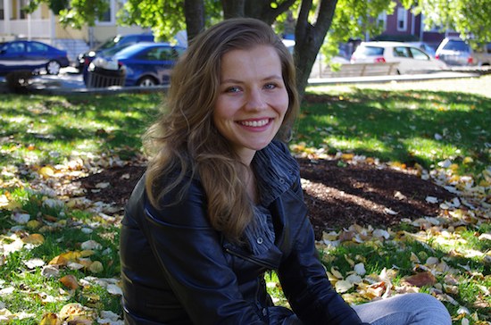
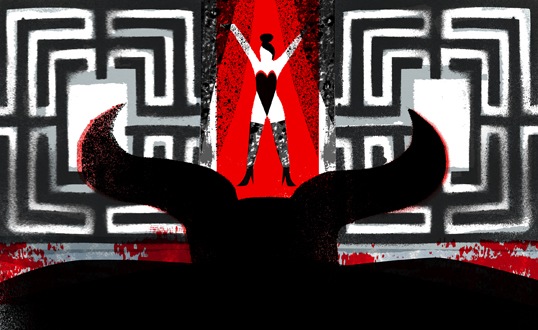
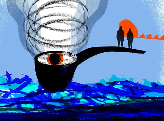
Asymptote’s guest artist for the current fall issue is Monika Grubizna (a.k.a. Long Muzzle). An independent graphic artist and illustrator, Monika created a striking cover image, as well as thirteen brand new illustrations for our Fiction, Nonfiction, and Drama sections. I interviewed her about this experience, her influences, and her practice.
Berny Tan: First question: Why “Long Muzzle”?
Monika Grubizna: I’ve always been obsessed with animals. Ever since I can remember, the main motifs of my drawings have been dogs. I enjoyed drawing bad wolves with open muzzles showing big, sharp teeth. And then I got a dog. The moniker “Long Muzzle” came to be because of my dog, whose snout is really, really long. Plus it sounds funny—at least in Polish.
BT: You have such a unique style that combines digital techniques with a traditional printmaking aesthetic. Could you take us through your process?
MG: I studied printmaking, so I’m very attached to traditional techniques. I like getting my hands dirty, the smell of paint, the texture of paper. Screenprinting has been my main medium for a very long time. I used to work intuitively, creating large half-abstract prints. The shift came after I had rediscovered the world of illustration from my childhood and had decided to devote myself to illustration. Now my process includes both traditional and digital media.
I usually start with a few rough sketches in pencil just to get a glimpse of the idea. After choosing the one I like the most, I start compulsively drawing a few versions of elements and textures that will appear on the final picture, cut some stencils, and spraypaint them afterwards. Then I scan everything and combine all the pieces digitally. I don’t do much editing on the scans, leaving all the spots and imperfections in place to keep the feel of handmade work. However, I still enjoy screenprinting and make personal projects using only that technique as well. Here is a short clip of me at the studio, so you can take a little sneak peek at the process.
BT: How did you come to draw inspiration from Polish poster art and Naive art? Could you tell us more about these traditions?
MG: I was brought up on books illustrated by the masters of Polish illustration from ’60s and ’70s such as Janusz Stanny and Bohdan Butenko. This aesthetic has stayed with me for years and is still something I’m completely drawn to—something I consider perfection in balancing words and pictures. As I was growing older, I discovered more and more graphic design from that time. Poster art in particular was very appealing to me, because of its strength and simplicity in communicating complex ideas. Polish poster art at the time of the Communist regime was blooming. Despite all the censorship and poor print quality, or maybe thanks to them, the artists developed very distinctive, concise styles and usually used hand lettering. It was more like a group of great individuals working at the same time than something we could call a regular art movement. Among the big names I admire the most are Jan Młodożeniec and Henryk Tomaszewski. When I started studying printmaking I had already been “sold” to rough shapes and strong color contrasts.
Expression and intuition have always been the foundation of my art, be it printmaking or illustration. What I love about Naive art is its spirit and sincerity. There are no tricks, just pure expression. The art of children and people with no professional training is a great source of inspiration for me. And I think that children are the best artists, so I’m doing my best not to grow up completely.
BT: What are your contemporary sources of inspiration, if any?
MG: Words—weird expressions that I stumble upon mostly on the internet. I take notes of funny or incorrect phrases (ideally both) posted on social media and sometimes use them as a starting point or title of my work.
BT: In your illustrations for Asymptote and your past editorial work, how do you balance image and text? What are the challenges of representing the text in one static image?
MG: I think about illustration as an interpretation rather than a representation of a written word. Usually I go with my gut and note the first couple of ideas that come to my mind just after reading the text. The concept is crucial. The perfect combination is when the picture complements words in a fresh, unexpected way.
BT: Among the thirteen texts that you illustrated for us, which text did you most enjoy reading, and which text did you most enjoy illustrating?
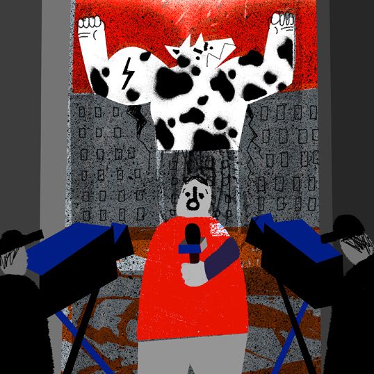
MG: My number one in both categories was the funniest one—“The Invasion of the Cows” by Karim Zaimović.
BT: Besides commercial illustration, what other projects do you have on your plate?
MG: Right now, I am gradually working on a few personal projects, including a new picture book as well as a series of screenprints and objects produced just for fun. Plus, I have just finished working on a children’s book that explains the meaning of some Polish proverbs and phrases, to be published by the Ethnographic Museum of Kraków in Poland.
***
Monika Grubizna, a.k.a. Long Muzzle, is a Polish printmaker, illustrator, and dog lover currently residing in Boston, MA. In 2010, she graduated with honors from Nicolaus Copernicus University in Torun, Poland with an MFA in printmaking. Since then, she has been working as an independent graphic artist and illustrator. Her art is inspired by Polish poster art legacy and Naive art, with lots of rough shapes, bold patterns, and high-contrast colorways. Her works have been presented internationally in many shows including Pictoplasma Berlin, Seoul International Book Fair, and Pick Me Up London. She has recently received awards from American Illustration 33 and 3×3 Professional Show No. 11.
Berny Tan is Asymptote’s Chief Executive Assistant. She was born and raised in Singapore, and graduated with a B.F.A. in Visual & Critical Studies from the School of Visual Arts in New York (2014). She is navigating her potential roles as artist, writer, designer, and curator, and has worked at art institutions in both New York and Singapore. Her artwork explores the interweaving of the systematic visual language of diagrams with a deep, emotional introspection, and her writing has been published in Ceriph. She is one half of the data visualization project Isle-to-Isle, which takes a diagrammatic approach to reading Jules Verne’s The Mysterious Island.
Read more:


